Blog Topic #4: Customize this!
Easy tweaks
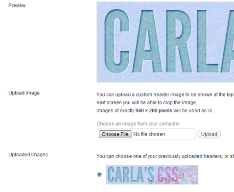
If you start with the default Twenty-ten theme, or some others like Skeptical, you can easily customize it by adding a header graphic and by changing the background color. These options do not require any knowledge of CSS and can be found under the Appearance section of the WordPress Dashboard.
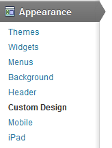
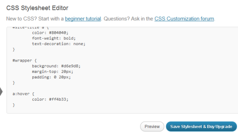
If you want to do anything beyond customizing the header graphic and the background color, you have to mess with the CSS yourself. Luckily, WordPress.com will let you do that, but it will cost you $30. Under Appearance > Custom Design, choose the Custom CSS to get to this CSS Stylesheet Editor.
You can choose to leave the theme’s CSS styles in place and simply override a style rule or two by naming it the same thing and overriding or adding properties. I just tried out previewing my changes, but I didn’t want to pay the $30 to save them!
So, I just focused on customizing the widgets and the things I could change for free.
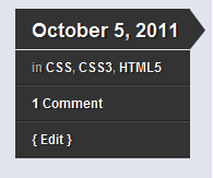
I really like the theme I have been using all along, Skeptical. It just has a clean look to it. I love its little call-out feature that highlights a post’s date, tags, and comments. I would never be able to create something like this on my own, so I decided to start with the Skeptical theme and tweak it just a bit.
Skeptical had a choice of a few colors so I chose blue to complement my header graphic, and chose to keep the RSS button visible in the header. I had the option to change my background color, but I stuck with the light blue from the blue version of the theme.
I noticed that as soon as I chose the blue version, any text I had tagged with <h2> or <h3> became a matching blue font – cool! Now I am glad that I tagged all of my headings properly within my past blog postings.
Sidebar Widget Area
To add Widgets to your Sidebar, go to Appearance > Widgets, and drag the Widgets you want into the Sidebar box.
Gravatar
As far as Widgets for my “Sidebar Widget Area”, I chose to display my Gravatar, which is an image uploaded to a separate Gravatar web site. This image should show up when I comment on other WordPress blogs now.
Pages
Pages are permanent pages, different from blog posts, so chose to link to my Pages here, which for now just includes an “About” page.
Category Cloud
For the Sidebar Widget Area, I also liked the blog post archive, and especially the category cloud, which makes a word cloud out of my tags, and seems to render the more frequently used tags in a larger font. This really gives someone a good sense of what the entire blog is about, and you can actually click on those words to get to that category.
Blogroll
I’m not an expert in blogging but it seems that your blogroll is important. It’s here where you connect to other blogs. More links to others helps them, and more links back to you helps you, so it seems like a mutually beneficial thing to have. When you add the blogroll, a generic set of links comes up, so to edit it, you need to go to Links.
Twitter Feed
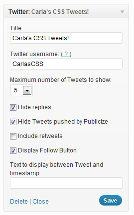
I also included my Twitter feed, if I ever decided I wanted to tweet! All you have to is enter your Twitter username and your tweets will show up. Now if I could only think of something to tweet about.
Footer Widgets
I placed a bunch of social media widgets at the bottom, in the footer area. I didn’t know much about some of these things so I figured this would give me a chance to try them.
First Widget Area: Facebook “Like” Box
This widget allows your readers to Like you right on your blog. It kind of makes the footer area look tall and weird but I like having it there. You have to have made a Facebook Page for it to work, and I believe if the reader wants to Like you, he or she has to be logged into Facebook, just like for any other Like button.
Second Footer Widget Area: Del.icio.us Bookmarks
Del.icio.us is a social bookmarking web site, which is basically a way to share your favorite web sites with others. I first had to visit the Delicious web site, set up an account, and then start bookmarking some sites. I had to bookmark five sites to make a “stack” and then I could make that stack public.
Delicious offers a fantastic Chrome extension that allows you to bookmark sites very easily. It’s that little tag icon in my toolbar below.
I was actually really becoming stoked on this whole Delicious thing, but I was bummed to find that the WordPress Delicious Widget is not working properly at the moment, apparently ever since ownership of the Delicious web site has changed hands. Various workarounds will get your feed to show up, according to this article, but I haven’t fiddled with any of them yet.
http://startier.wordpress.com/2011/10/04/wordpress-delicious-work-around/
Third Widget Area: Blog Stats
I placed all sorts of Blog Stats in this column, from Hits to Top Posts and Pages. I am not really sure how each of these different statistics are calculated yet, but it seems like interesting information so far.
Fourth Widget Area: Comments
This is a handy little widget that displays all of the recent comments on my blog, no matter what post they were attached to. I like it because I can see everyone’s icon, and because all of the comments are in one place. My theme is not set up like that, so I can’t normally see the comments in this way. I might think about moving this widget up to the sidebar so it will be more visible.
Meebo
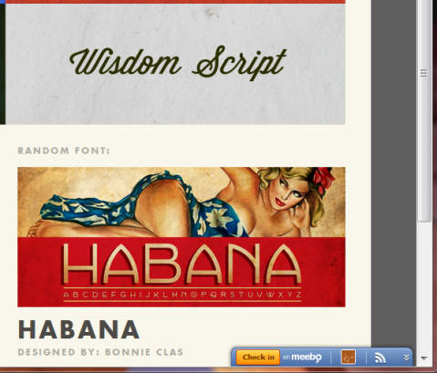
I originally had a Meebo Widget in the Fourth Widget Footer Area, but it didn’t seem to stay there, and would stick right in the middle of the page, which was kind of annoying, so I removed it. I was pretty cool since it would allow blog readers to message me instantly. I just wish I could get it to stick on the side of the browser window or something.
Meebo started out as a service that allowed you to sign in to all of your chat programs at once, but it also seems like it’s evolving into something else, kind of like a bookmarking site, where you check in at web sites you like.
So, I made an account, installed the little Check-In bar, and starting checking into sites. You can set it up so it will automatically check you in to sites that you specify. So, the site that I check into, as well as any comments I want to add, are displayed on the Meebo web site.
I am not sure if my check-ins are actually displayed in my Meebo widget though. The widget might just be for chatting. I’m still trying to figure out this whole Meebo thing, and maybe I’ll put the widget back up on my site at some point.
Other customization
So, it costs $30 to customize a separate CSS style sheet, but there are some things you can do if you really want to. You can add inline CSS styles, although you really don’t get the control of an overarching stylesheet. Say, you wanted to insert a div and color it with CSS, you could do that in HTML view! But, just remember anything you style inline in your post will override the styling from a theme, so keep it fairly flexible. You probably want it to be able to pick up the same font as the rest of your text, and maybe some other properties.
You can also mark your headings with the proper H1-H6 tags so that they will display properly with whatever theme you choose. I have not seen a way to apply these tags in the “Visual” version of the post editor, but if you switch to HTML view, you can add them in manually.
Follow up to Web Typography Post
“Part 2” of the Web Typography article series on Creative Pro finally came out! This one deals with the legal issues surrounding web fonts.
Here it is:
What You Need to Know About Webfonts: Part 2
http://www.creativepro.com/article/what-you-need-know-about-webfonts-part-2
And here was the Part 1:
What You Need to Know About Webfonts: Part 1
http://www.creativepro.com/article/what-you-need-know-about-webfonts-part-1
Topic #2 – Can I get a resource?
Designing with CSS Frameworks
What are they? Why use them?
A CSS grid or framework is like a template, or like a larger version of a code snippet that you use over and over again.
A framework serves two purposes. It keeps your design neat, clean, and balanced, like the classic graphic design grid, and it also helps you to eliminate some repetitive coding. A lot of designers start many of their web projects the same way, with the same basic structure, and customize it from there, so these grids do some of that repetitive work for you.
To use these frameworks, you download a package containing HTML and CSS files. These CSS files contain styles that corral your content into a neat little grid system, made up of several columns and gutters. Most frameworks also provides you with a CSS reset. These things provide the starting point for your web site, and you customize it from here.
You can use these frameworks with little CSS knowledge, but you will benefit the most if you are already familiar with CSS layout, and can tweak these files to meet your needs.
Why are CSS frameworks considered controversial?
Frameworks are somewhat controversial because many of them do not use semantic markup, meaning that the class names like column1 or div7 or width3 used to organize the columns have no real descriptive meaning. With HTML5, we are moving toward more semantic html tags, with the addition of tags such as <header>, <article>, <section>, and <footer>.
For more on this, please see my related post:
Experimenting with HTML5 Structural Tags
There are some new HTML5 frameworks out there that are supposedly more semantic than the original CSS frameworks, which I link to further below in my list of frameworks.
How do I use them?
This awesome article from Six Revisions, titled The 960 Grid System Made Easy, makes all of the complicated stuff easy to understand, and goes into detail about how the columns are set up and how to adjust them.
http://sixrevisions.com/web_design/the-960-grid-system-made-easy/
Also, this article from A List Apart describes the reasoning behind CSS Frameworks very well:
http://www.alistapart.com/articles/frameworksfordesigners/
Which one should I use?
There are many CSS frameworks out there. Some are fixed, some are fluid, and some now use HTML5 and CSS3 (these new ones supposedly being more semantic). Here are a few:
1. 960 Grid
The 960 Grid was one of the first, and is very popular. Their web site has lots of examples of designs built using their grid, and you can press a button to show the grid overlaid on the design, which really helped me to visualize the underlying structure. I especially love their printable PDF grids, because I like to hand-sketch a web page layout, and now I know it will correspond to my CSS layout.
2. Fluid 960 Grid
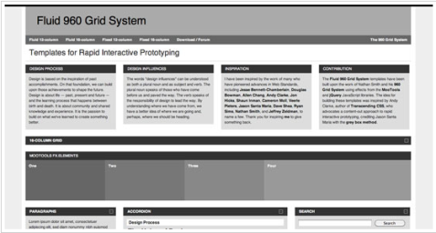
A fluid version of the 960 grid. Use this if you want your layout to stretch and contract with the user’s screen size.
http://www.designinfluences.com/fluid960gs/
3. 1KB CSS Grid
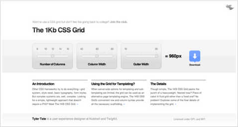
A lightweight grid.
4. Tiny Fluid Grid
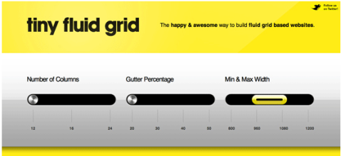
A fluid version of the 1KB Grid.
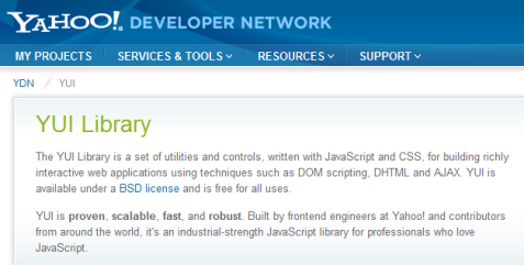
5. Yahoo YUI
It’s been around for a while and is on its third iteration. Includes JavaScript as part of the framework.
http://developer.yahoo.com/yui/
6. Blueprint CSS
This one includes styles for forms, for printer-friendly pages, and for typography:
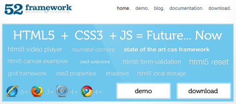
7. 52 Framework
An HTML5 and CSS3 framework
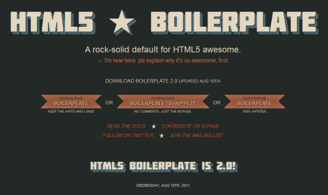
8. HTML5 Boilerplate
This boilerplate code can be integrated with other grid systems such as the 960 Grid, Compass, and Less, and even into your WordPress theme. Read the “Docs” page for details.
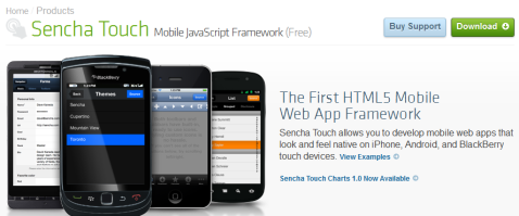
9. Here are some far-out frameworks, including those that use JavaScript, and ones for building HTML5 games and touch-screen apps. Check out this amazing collection compiled by another blogger:
http://rachit-myvoice.blogspot.com/2011/03/html5-and-css3-frameworks.html
WordPress.com introduces a new “Follow” button
Hey, this is new!
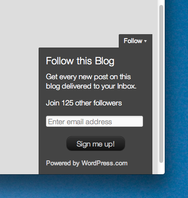
I just got an email from WordPress that says they added a new “Follow” button yesterday, to make it easier for non-Wordpress users to follow WordPress blogs.
I checked it out, and it is indeed there on my blog now, but I only see it when I’m signed out of WordPress, just how they describe. Cool!
http://en.blog.wordpress.com/2011/09/21/more-traffic-for-your-blog-with-the-follow-button/
Experimenting with HTML5 structural tags
Using the new HTML5 structural tags requires a little bit of a shift in thinking. If you’re used to using <div> tags for everything, it can be a little hard to get used to. But, just think about it – you would normally name your <div> tags something like <div id=”header”> and <div id=”footer”>, so these new tags just make it a little easier to create those commonly used sections.
You can use the structural tags as-is, or you can apply styling to them with an id or class. It seems that the <header> and <footer> tags would most likely be used only once, and therefore, they would be used without any classes or ids applied to them. They would simply be styled with CSS selectors, like this:
HTML
<header>content</header>

<footer>content</footer>
CSS
header {property:value}

footer {property:value}
On the other hand, a tag such as <section> could be used numerous times, and nested inside of itself. Therefore, I would apply ids and classes to it, to further organize the content, and so I could apply different CSS styling to different instances of the <section> tag, like this:
HTML
<section id="mainpoemtext">
<section id="poempart1">

 </section>
<section id="poempart2">

 </section>
</section>
CSS
#mainpoemtext { }

#poempart1 { }

#poempart2 { }
I haven’t experimented with the rest of the structural tags yet, such as <article> but these three seem to work for what I need so far.
Something to remember is that currently, these tags have no default style, so think of them kind of like a <div> tag, which is almost like a blank canvas. (For an example of default browser styling, something like <h1> is larger and bold by default.) But, the difference is that browsers know that a <div> is a block level element, which means it takes up a whole block or line. Something like <span> is an inline element, which is why you can apply it to one word within a paragraph. So, for these new tags, if you want them to behave like block level elements, like how <div>’s normally behave, you need to tell the browser this in your CSS. When you create your CSS styles, either using selectors, classes, or IDs, you add a property to tell it to display like a block level element, like this:
CSS (Selectors):
header {display:block;}

footer {display:block;}
CSS (IDs):
#mainpoemtext {display:block;}

#poempart1 {display:block;}

#poempart2 {display:block;}
One other thing to keep in mind is that these selectors may need some JavaScript help, in order for them to work in Internet Explorer. I added this small script into the <head> section of my page, and it worked like a charm! It is creating “DOM (Document Object Model) nodes” for each of these tags. I would assume this is because these tags are not yet a part of the regular DOM. You would repeat what I did here for every tag you need. You can see I used <header>, <section>, and <footer>.
<script>

document.createElement('header');

document.createElement('section');

document.createElement('footer');

</script>
I want to say thank you very much to the web site Ordered List. Their article pointed out that the CSS styling needing display:block, and that we need that little bit of JavaScript in the head section. I could not have gotten these structural tags to work without these two tips!
http://orderedlist.com/resources/html-css/structural-tags-in-html5/
I’ll keep you posted as a work through the other HTML5 structural tags, and other aspects of HTML5!
Topic #3: What is RSS?
RSS Icons
As I was researching this topic, I was totally distracted by the wide selection of adorable RSS icons out there, so I will paste them throughout my post.
It just goes to show how popular RSS and blogging have become – every artist out there has created his or her own unique take on the icon.
If you are wondering where you can find a cool RSS icon for yourself, this designer has generously taken the time to locate hundreds of free RSS icons that are ready to download and use:
http://naldzgraphics.net/freebies/800-most-wanted-free-rss-icons-for-bloggers/
What is RSS?
So, what is RSS? RSS, often times called Really Simple Syndication, is a term used to describe a web feed and how it can be distributed. An RSS file contains content or data, like an article you might write for your blog.
This content is stored in XML format, which allows the data to be transported easily and read and interpreted by different types of reader programs. Once someone has signed up for your RSS feed, every time you make a blog post, they will automatically receive it using whatever RSS reader they have chosen.
RSS Readers
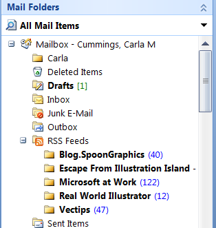
There are many ways to receive RSS feeds. One of my favorites is receiving relevant blog posts in my inbox in Microsoft Outlook at work. Outlook will allow you to create a separate section of your mailbox in which you can receive the RSS feeds you are subscribed to, so you can read graphic design news in the morning along with your email. You open up the blog post, and it looks just like an email. So, you can see how RSS content can flow into different types of formats and readers.
Here are the instructions on how to do this in Outlook if you are interested:
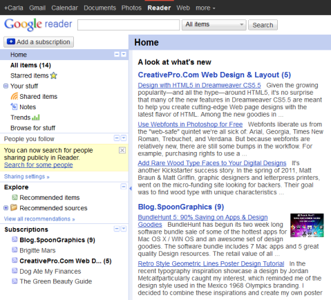
There are many other types of RSS readers (or aggregators I guess they are called) out there. You can also subscribe to RSS feeds through your Google account, through their reader. You can see that the formatting of the RSS feeds look a little different here than they do in Outlook (and also that in Google Reader I have subscribed to some different feeds!)
http://www.google.com/reader/view/#overview-page
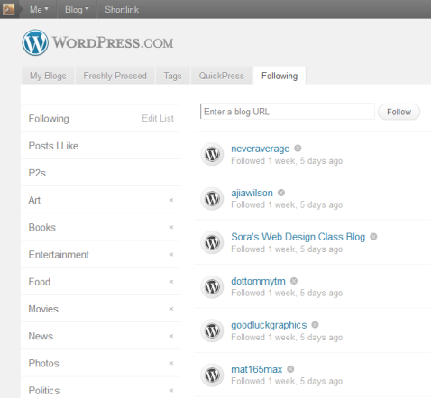
Also, if you have created a WordPress blog, it’s really easy to follow other WordPress bloggers. Once you have clicked the RSS icon or “Follow” tab on their site in order to follow them, their RSS feeds will show up in your own WordPress account on the Home page, under the Following tab. I believe you may have to be logged into your blog before you follow them for this to work.
Anyway, the point is that, with an aggregator or reader, you can see all of your favorite blog posts in one place, and once you have subscribed to them, you don’t have to do anything else to see new content.
My favorite RSS feeds
Well, I think I will finish up this post with links to some of my favorite illustration blogs that are in my RSS reader. Just visit these sites, and when you are there, click the RSS icon or similar button to subscribe to their feed.
- Vectips Weekly Vector Illustration – very cool, modern vector illustration, collected from various artists around the web
- Escape from Illustration Island – this site focuses on more traditional illustration and the business of being a professional illustrator
- BlogSpoon Graphics – fun design and illustration how-tos
- Scanning around with Gene at CreativePro.com – Gene Gable writes this hilarious article on vintage advertisements and graphic design, which includes tons of scanned items found at garage sales and in old basements. If you are looking for vintage inspiration, this is the place to find it!
And, here’s the best RSS icon I found so far, it’s an RSS pillow!
Topic #5: Web Typography
How cool is this?… Beautiful web typography using @font-face
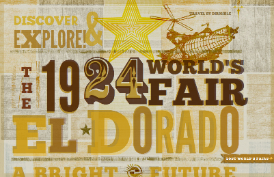
This gorgeous page uses no images for its typography—only fonts declared using the @font-face declaration, which allows for fonts to be downloaded from a web server to the user’s computer.
The Lost World’s Fairs: 1924, El Dorado
http://lostworldsfairs.com/eldorado/
Not only is the typography on this site cool, but the overall look of the site is interesting. It uses an old-fashioned tea-stained color palette. The slight touch of light blue punches up the all-warm color scheme. I’d say it’s got maybe a “Steampunk” feel to it, with the two-toned wood-cut train illustration and the zeppelin drawing. A peek at the CSS reveals this site’s generous use of the hsla property to create soft, transparent layers of type.
These other sites are part of the “Lost World’s Fairs” project and are also very cool. They are each designed in the style of a specific time period, and conjure up a fictional World Fair that would take place in that era, or imagine one that would take place in the future.
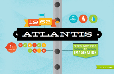
The Lost World’s Fairs: 1962, Atlantis
http://lostworldsfairs.com/atlantis/
Take a journey under the sea to the lost city of Atlantis! I think some CSS positioning was used to make the man stay put as the metal tube appears to scroll. Make sure you scroll ALL the way down and watch the “leagues” counter on the left – so cool!
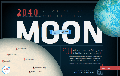
The Lost World’s Fairs: 2040, The Moon
http://lostworldsfairs.com/moon/
This future World Fair takes place on the moon! The fixed position of the Earth and the moon create an interesting effect when the browser is re-sized horizontally or vertically.
The Lost World’s Fairs project is explained here, where you can meet the contributors and view the fonts they used:
If you want to begin using the @font-face declaration, you will need some fonts that can be used on the web.
Many type foundries or web sites where you can purchase or download free fonts will now provide you with a web font package, which includes the formats you will need such as .woff (Web Open Font Format – for modern browsers and mobile devices) and .eot (Embedded OpenType Format – for older IEs), to cover the requirements of all browsers and mobile devices. MyFonts includes such a service, which is explained very well here in their FAQs:
http://webfonts.myfonts.com/faqs
Also, MyFonts has a great collection of examples of web fonts in action:
http://webfonts.myfonts.com/webfonts-action
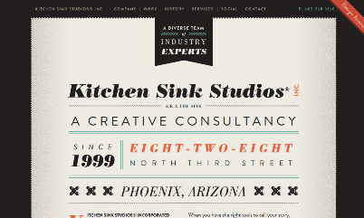
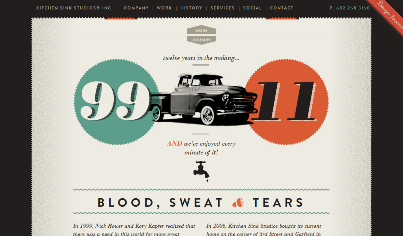
An example from their collection, this award-winning site created by Kitchen Sink Studios, uses elegant web typography and a restrained but beautiful color palette. The web fonts from MyFonts.com, Brandon Grotesque and Poster Bodoni, are used throughout the site.
Kitchen Sink Studios
Welcome to Carla’s blog!
Carla’s blog about the web…

